Both a joy and a challenge: Mobile Responsiveness
TechnicalReflectiveTechnicalBehind the Scenes
As a fresh developer, when I start a project, I design desktop first most of the time. stays somewhere in the back of my mind until that day comes: “Desktop is done. Let’s focus on mobile now.” But that brings a whole new set of problems.
What I enjoy about it is that it really triggers my problem-solving skills. At the same time, that’s exactly what makes it challenging. Some interactions you really like on desktop just don’t work on mobile, so you have to come up with completely different ideas.
In this article, I’ll go through a few architectural decisions I made while adapting Pizza God for mobile.
Hero section: hover effects on buttons
One of the first interactions that gives Pizza God its identity is the hover effect on the hero buttons. On mobile, though, there’s no cursor, so the animation would never play. I didn’t want mobile users to completely miss that part of the experience, so I decided to play each hover animation once, shortly after the page loads. Think of it as a small demonstration before the user starts interacting with the page.

Demoting the sticky logo: only keep what's necessary
On desktop, there’s a scroll-based transition between the hero and the rest of the page. As you scroll down, the logo gradually shrinks until the hero section ends, then settles on the left side of the screen and stays there.
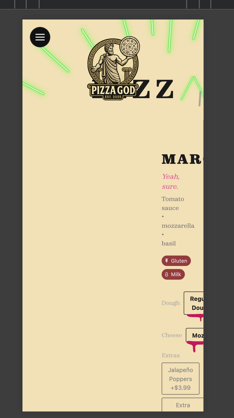
That approach simply didn’t work on mobile. At around 390px wide, the logo was taking up too much space and started overlapping other components. Instead of trying to force it to work, I removed it from the page and moved it into the hamburger menu. It’s still there, but only appears while the menu is open.
Symmetrical drawers: a visually satisfying decision
Desktop has a fixed sidebar, but at 390px there simply isn’t enough room for it, so a hamburger menu was the obvious solution.
Once I saw it open, I noticed something I really liked. The menu was covering roughly 80% of the screen from the left. Since I also needed a cart for mobile, I thought, “Why not mirror it?”
So I placed the cart button in the opposite corner. The navigation drawer slides in from the left, while the cart drawer slides in from the right. Both cover exactly the same amount of space, giving the layout a nice sense of symmetry.
Having two drawers also created a rule: only one of them should ever be open at a time.
Instead of giving both drawers separate isOpen states and making them close each other, I used a single state that stores which panel is currently open. Since one variable can only hold one value, opening both drawers at once simply isn’t possible.

That decision ended up helping later. When I added the checkout flow, I didn’t create another drawer. Checkout simply became another phase inside the cart drawer, so nothing about the overall panel logic had to change.
None of these decisions were particularly difficult on their own. The challenge was keeping Pizza God’s identity while accepting that mobile is simply a different platform with different constraints. Sometimes you have to let go of an idea you really like and come up with a new one that works better.